I worked with a brewery in Doral, FL called The Tank on some projects. Here are a few of them.
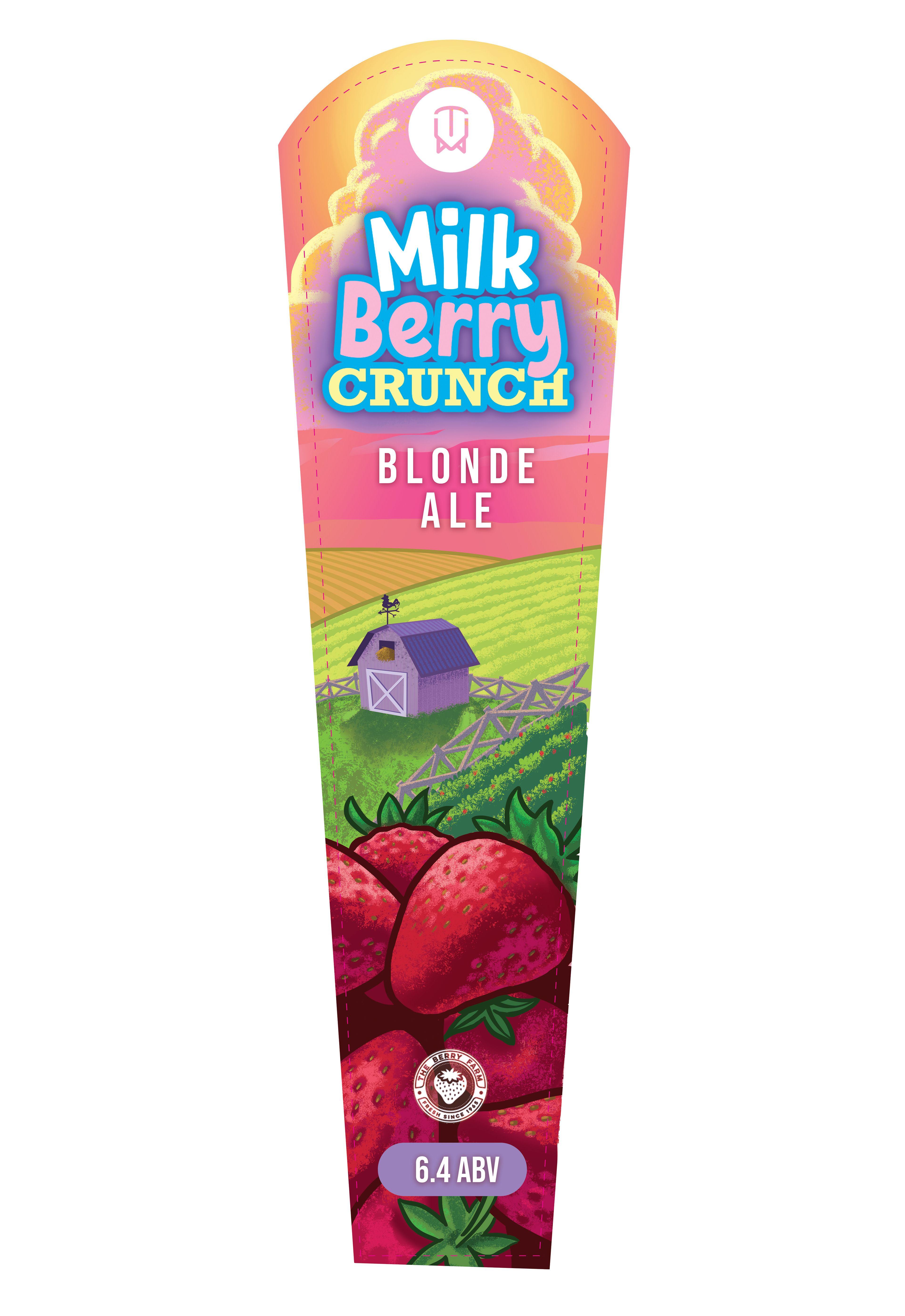
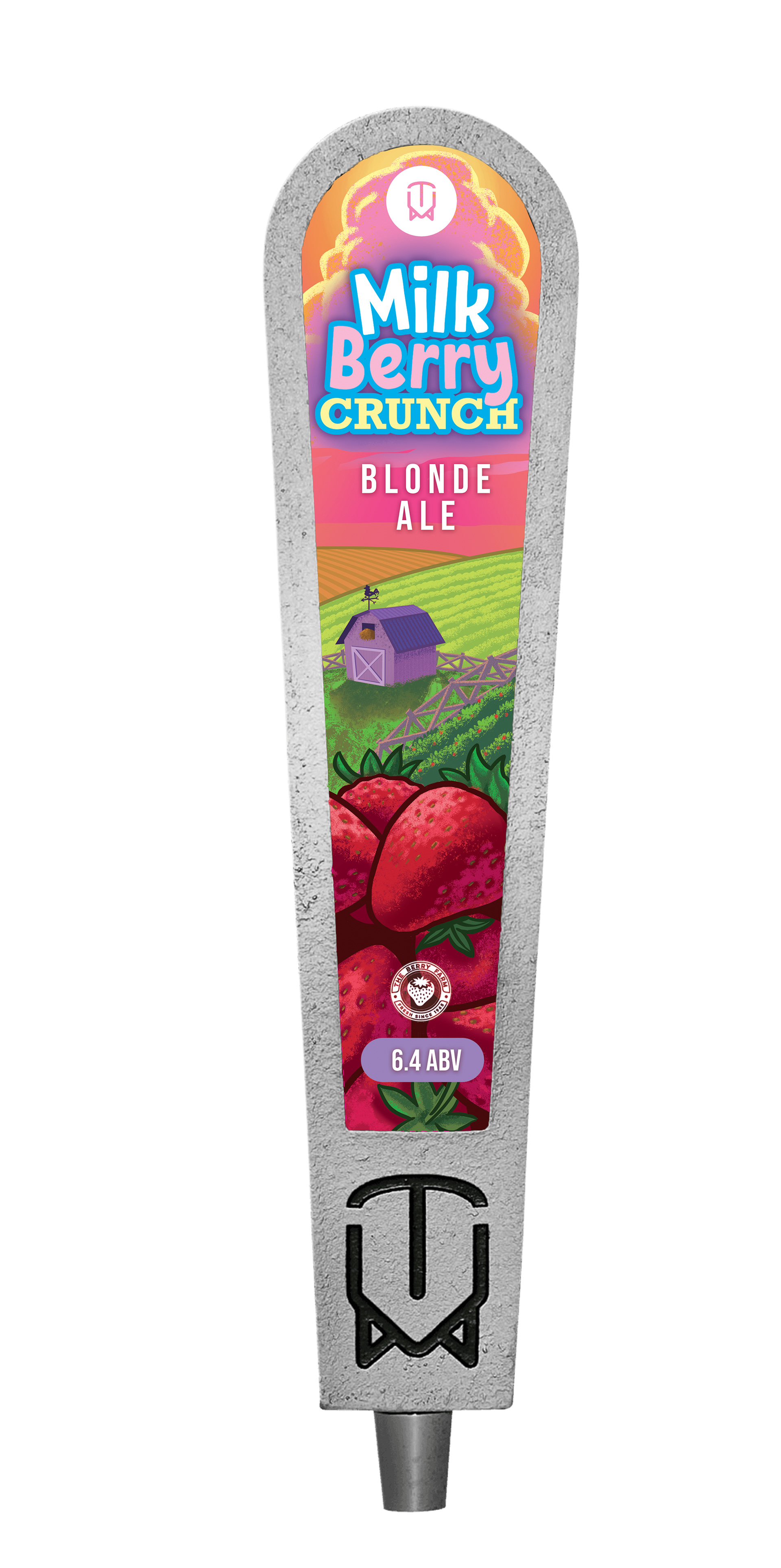
The first one was a tap handle for a limited release brew that they were collaborating on with a local farm. It had hints of strawberry and was light and crisp in flavor. I decided to not reinvent the wheel, so to speak, and I illustrated a farm, with strawberry fields and strawberries in the foreground in front of a sunset with pink skies and lavender clouds. The colors were very important as they were very suggestive of the softness of the beverage.
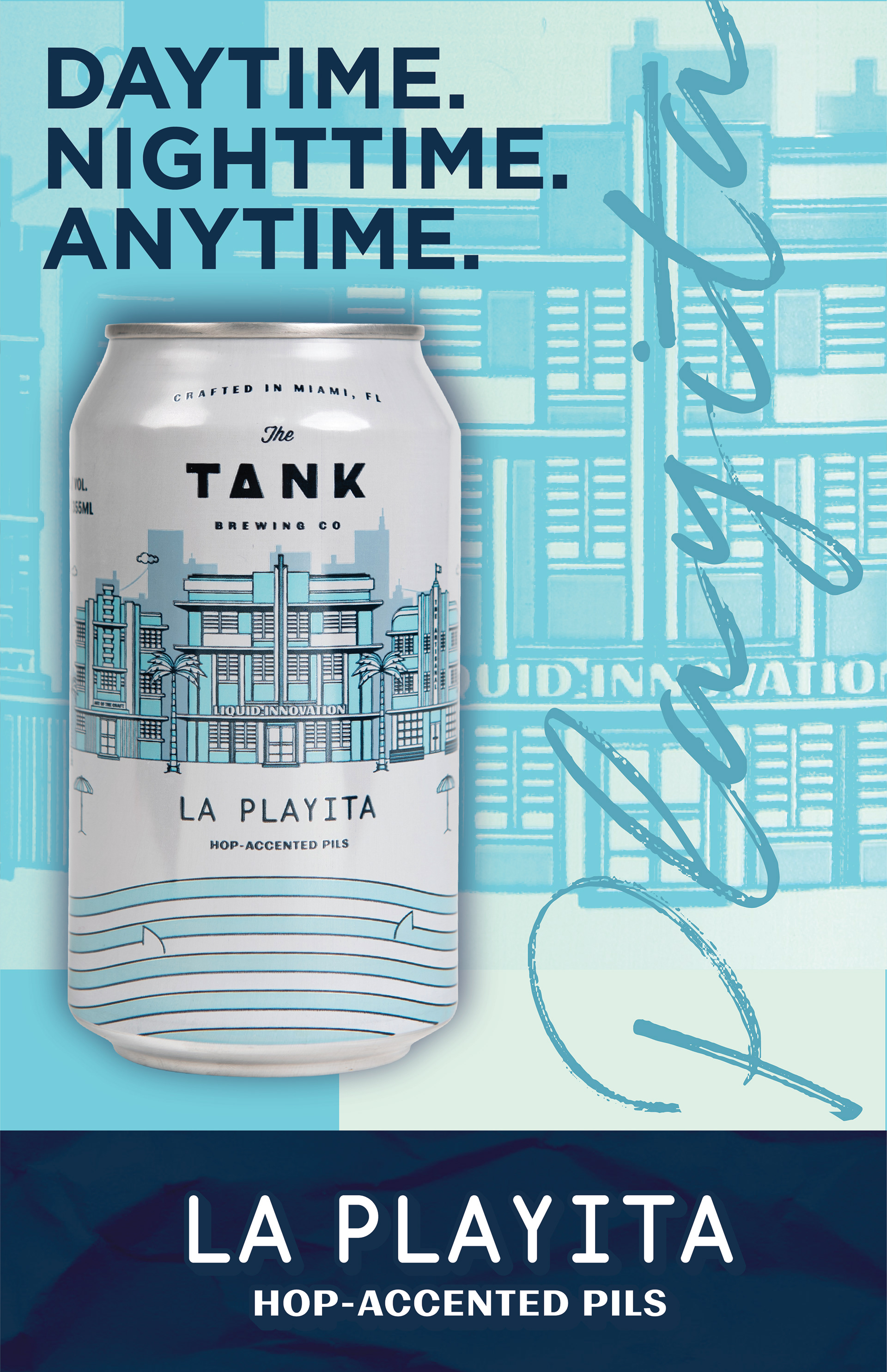
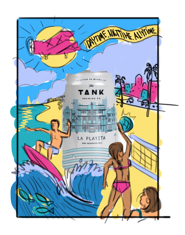
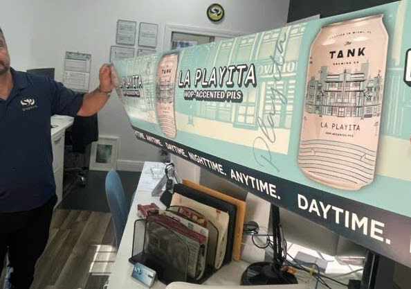
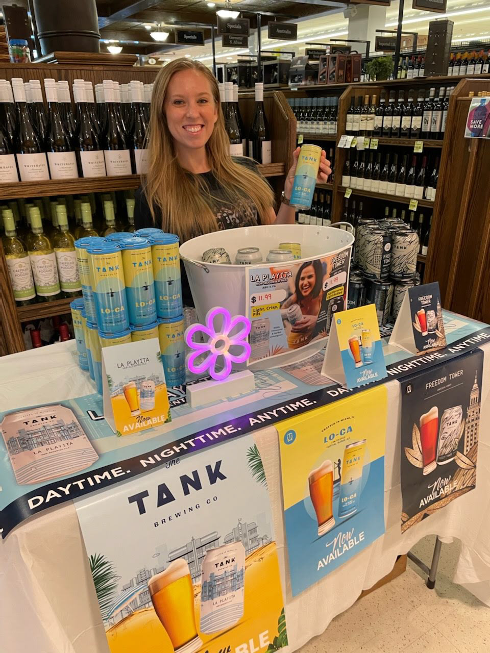
The second project was a simple case card for one of their flagship brews, La Playita. As you can see below we originally were going for something bright and colorful and very illustrative but then decided to go 180 and go for something a bit more modern, neat, and more aligned with the visions they wanted for the beer. I used the beer design itself as the background and created a tagline for it "DAYTIME. NIGHTTIME. ANYTIME". The final result is more on brand not only with the product but with the brewery it self.
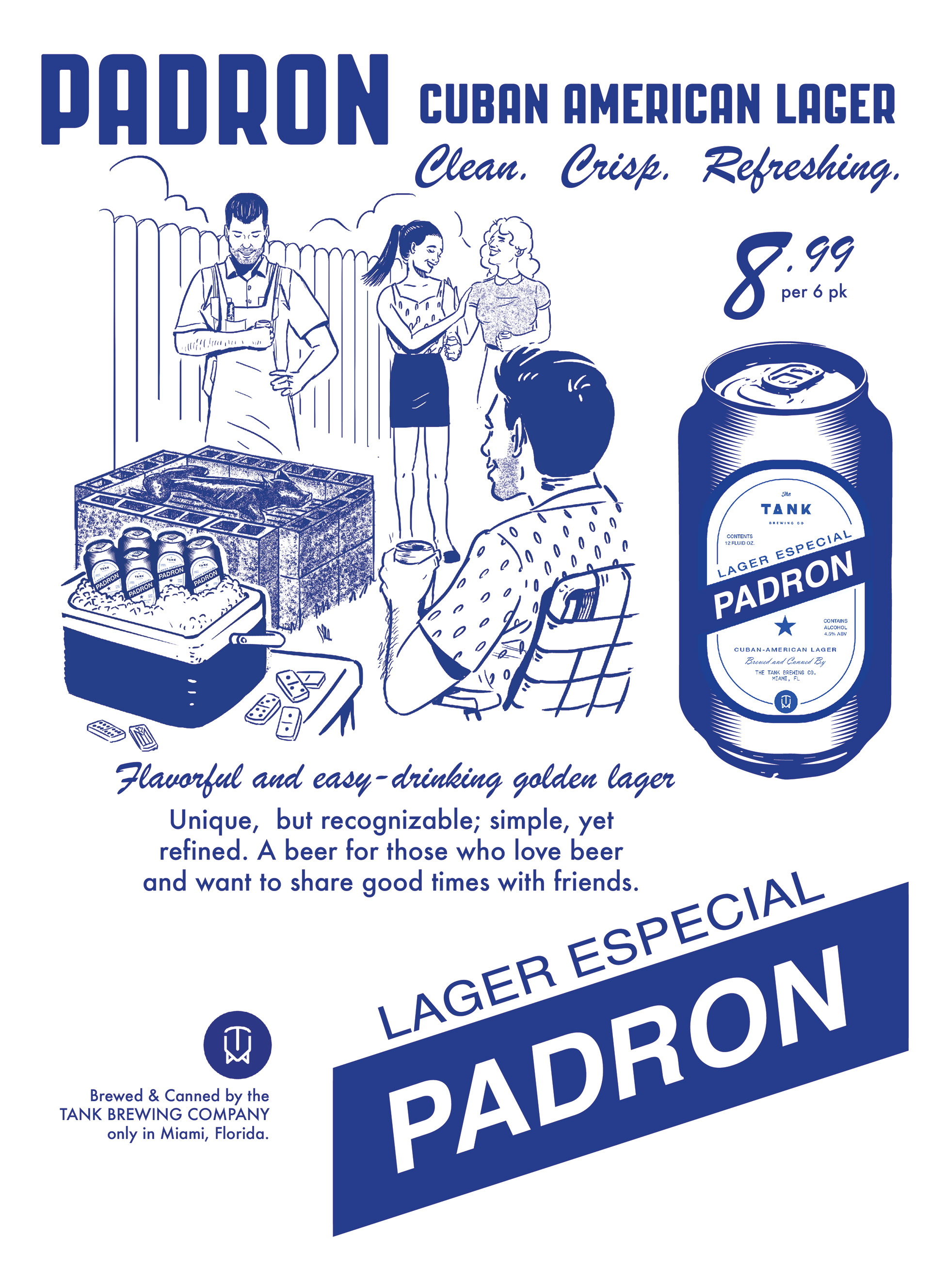
The last project was a promotional image created solely for internal use to grab the attention of investors and higher ups. It was to target 20-40 somethings living in Miami with a Cuban-American twist to it. The roasting of the pork in the cinder blocks and a friendly cookout among friends. The mid century approach to the poster's design lent itself very well to the identity of this culturally based brew.